
Anchor Charts: How to Make, Print, and Reuse Them (With Ideas by Subject)
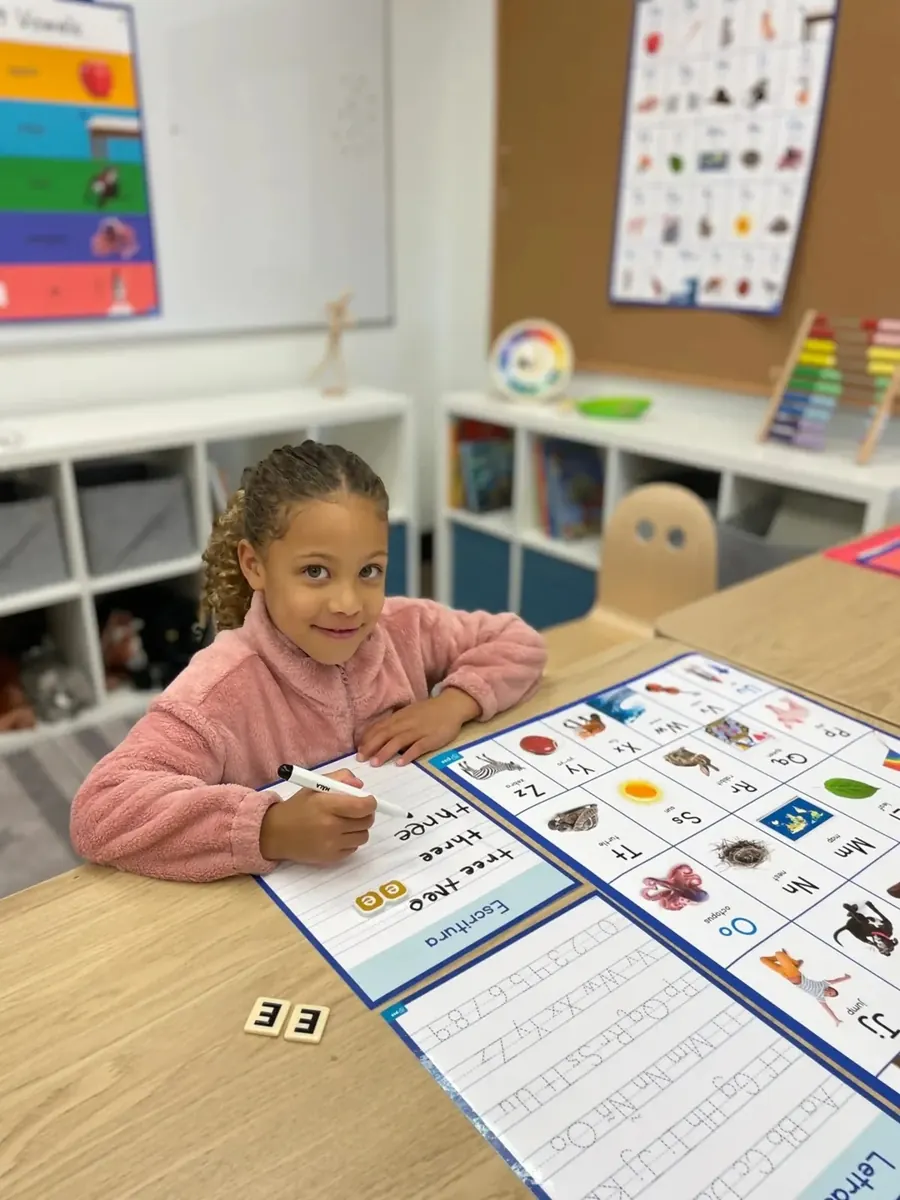
An anchor chart is a visual reference built during or after a lesson and left on display so students can return to it independently. The name is literal: it anchors the thinking from a lesson in the room, so a student who has forgotten the steps can look up instead of asking. This guide covers how to make one, when a printed chart beats a hand-drawn one, how to print at display size, ideas by subject, and how to store charts so you are not rebuilding them every August.
What an Anchor Chart Is and Why Teachers Use Them
A common feature is co-construction: the chart is made with students, capturing their language rather than presenting a finished poster. Many teachers find that a chart recording the class's own wording gets referred to more often than one that arrives pre-made.
The practical appeal is that the chart offloads memory. Rather than re-explaining a process, the teacher points. Students working independently check the wall. For multilingual learners and students who need processing time, a permanent visual reference can support what a spoken instruction alone does not.
A good anchor chart is usually:
- Focused on one concept. Several strategies on one chart tends to read as a poster; one strategy reads as an anchor chart.
- Legible from student seating. If it cannot be read from the back row, it will not be used from the back row.
- Sparse. White space helps students find what they need.
- Displayed where the work happens, not filed away after the lesson.
Hand-Drawn Versus Printed: When Each Makes Sense
Neither is better in general, and most classrooms end up with both.
| Hand-drawn | Printed | |
|---|---|---|
| Best for | Charts built live with students, one-off concepts, capturing student language | Reference charts reused each year, multi-class sets, charts needing durability |
| Time cost | Lesson time, plus prep for neat versions | Design time once, then minutes to print |
| Consistency | Varies by teacher | Identical across classrooms |
| Revision | Rewrite | Edit and reprint |
| Student ownership | High, if built together | Lower, unless students contribute the content first |
A workable hybrid: build the chart with students on the day, then produce a clean printed version of the ones that turn out to be keepers. The students' language is preserved, the chart is legible all year, and you can reprint it next year without rebuilding it.
Designing a Chart in Canva or Google Slides
Both tools work, and the steps are nearly identical.
- Set the page to the finished size before you start. In Canva, choose custom dimensions; in Google Slides, use File, then Page setup, then Custom. A 24-by-36-inch chart can be set at those dimensions directly, or built at the same 2:3 proportion and scaled at print time.
- Choose type large enough to read at distance. As a rule of thumb, about one inch of letter height per ten feet of viewing distance. For a chart read from 20 feet, headings want to be around two inches tall.
- Use high contrast. Dark text on a light background is more legible across a room than light text on a dark background, and it uses less ink.
- Limit yourself to two typefaces, one for headings and one for body text.
- Leave generous margins. Text crowding the edge is harder to read and risks being trimmed.
- Export to PDF. PDF preserves fonts and layout more reliably than sending the working file to a printer.
If students contributed the wording, type their words rather than paraphrasing. The recognition is the point.
Printing at 24-Inch Size: Paper and Durability
Wide-format school printers typically run 24-inch roll media, which produces a 24-inch-wide chart of whatever length you need. That covers standard poster proportions and taller vertical references.
Material choices and when each applies:
- Standard paper. Fine for charts that change with the unit. The default and the cheapest.
- Premium coated paper. Better color and a more durable surface for charts that stay up all year.
- Peel-and-stick. For walls that will not take tape, or surfaces where tape damages paint.
- Magnetic media. For whiteboards and metal surfaces; repositionable all year.
- Vinyl or waterproof material. For high-traffic areas, or anywhere near water, such as a science lab or a cafeteria.
Anchor Chart Ideas by Subject
Reading. Decoding strategies, story elements, text features, fiction versus nonfiction, making inferences, retelling structure, comprehension check questions.
Writing. The writing process, sentence types, transition word banks, editing checklists, paragraph structure, revision versus editing, evidence sentence starters.
Math. Place value, strategies for addition and subtraction, fraction models, key words in word problems, the order of operations, how to show your thinking, math vocabulary.
Science. The scientific method, observation versus inference, states of matter, the water cycle, lab safety expectations, how to record data.
Classroom routines. Morning arrival, what to do when finished early, voice level scale, group work roles, transitions, how to ask for help, restroom procedure.
The routine charts are often the highest-value printed ones, because they are identical in every classroom in the building and they get used every single day.
Bilingual Anchor Charts for Multilingual Classrooms
A bilingual chart can serve two purposes at once: giving multilingual learners access to the content, and signaling that their language belongs in the room.
Practical approaches:
- Side-by-side columns, English on one side and the second language on the other, which lets students compare directly.
- Vocabulary pairing, where key terms appear in both languages with a shared visual.
- Visual-first design, where a diagram carries the meaning and text in both languages labels it.
Have translations checked by a fluent speaker rather than relying on machine translation for anything going on a wall for a year. Academic vocabulary is where automated translation most often goes wrong.
Storing, Reusing, and Reprinting
Charts often get rebuilt each year because the originals were not stored in a way that survived.
For physical charts: store flat rather than rolled where possible, or roll loosely with the printed side out. Label the back with subject, grade, and unit. A labeled bin or a tube rack in a shared workroom beats a stack behind a filing cabinet.
For digital files, this is the part that actually matters. Keep the source files in a shared grade-level folder with a consistent naming pattern, such as G3-Math-PlaceValue-v2. A chart stored as an editable file can be corrected, updated, and reprinted in minutes. A chart stored only as paper has to be remade.
Build the habit at the team level rather than individually. A grade-level team that shares one folder builds a library across a few years that new teachers inherit.
Using Folio Resources Alongside Teacher-Created Charts
Not every chart needs to be built from scratch. Folio is a library from PSS K12 of hundreds of standards-aligned posters, games, and interactive resources in English and Spanish, with whole-school access; current pricing is on the Folio page. Ready-made resources handle the reference material that is the same in every classroom, which leaves teacher time for the charts that genuinely need to be built with students.
Producing charts at display size requires a wide-format printer. The PSS Poster Maker System is a 24-inch wide-format printer with a preconfigured workstation, software, installation, training, and a two-year on-site warranty; PSS states a poster prints in about two minutes once the file is ready. The Principal's Every-Wall Plan adds twelve months of unlimited paper and ink, plus ready-to-use templates for anchor charts, PBIS, SEL, safety signage, and hallway displays. Paper and specialty media are available separately.
Frequently asked questions
How do you make an anchor chart?
Pick one concept, build the content with students so the chart uses their language, lay it out with a clear heading and generous white space, size the text to be readable from the back of the room, and display it where students work. If you want a durable version, rebuild it in Canva or Google Slides at final size, export to PDF, and print it.
What size should an anchor chart be?
Large enough to read from student seating. Chart paper is commonly 24 by 32 inches, and 24 by 36 is a standard printed size. As a guide, allow about one inch of letter height per ten feet of viewing distance.
Should anchor charts be hand-drawn or printed?
Hand-drawn works best when the chart is built live with students. Printed works best for reference charts reused across classrooms and years. Many teachers build by hand first, then print a clean version of the charts worth keeping.
How do you print an anchor chart at full size?
Set your document to the finished dimensions in Canva or Google Slides, export to PDF, and print on a wide-format printer, typically 24-inch roll media in schools. Standard paper suits charts that change; premium coated or peel-and-stick suits charts staying up all year.
How do you store anchor charts between years?
Store paper charts flat or loosely rolled with the printed side out, labeled by subject, grade, and unit. More importantly, keep the editable source files in a shared grade-level folder with consistent naming so charts can be updated and reprinted rather than remade.
Sources
- Folio library contents and current pricing: https://pssk12.com/folio
- PSS Poster Maker System, print width, installation, training, and warranty: https://pssk12.com/poster-maker
- The Principal's Every-Wall Plan, templates and unlimited supply terms: https://everywall.pssk12.com
- PSS paper and specialty media: https://shop.pssk12.com